top of page
BrainStation UX Design Certification
Let's Eat App
Timeline
September 2024 - November 2024
Tools
Figma, FigJam
I've always been passionate about expanding my design skill set, which led me to pursue BrainStation’s UX Design Certificate program. Over the course of two intensive months, I gained hands-on experience in applying user-centered design principles, conducting research, and developing a digital product from the ground up.
As a solo designer, I conceptualized and executed Let’s Eat, a mobile application designed to provide users with a reliable and intuitive tool for tracking their daily nutritional needs. The project allowed me to explore the full UX design process, from problem discovery and user research to wireframing, prototyping, and usability testing. It was an opportunity to combine purpose-driven design with functionality, reinforcing my commitment to creating thoughtful and impactful user experiences.

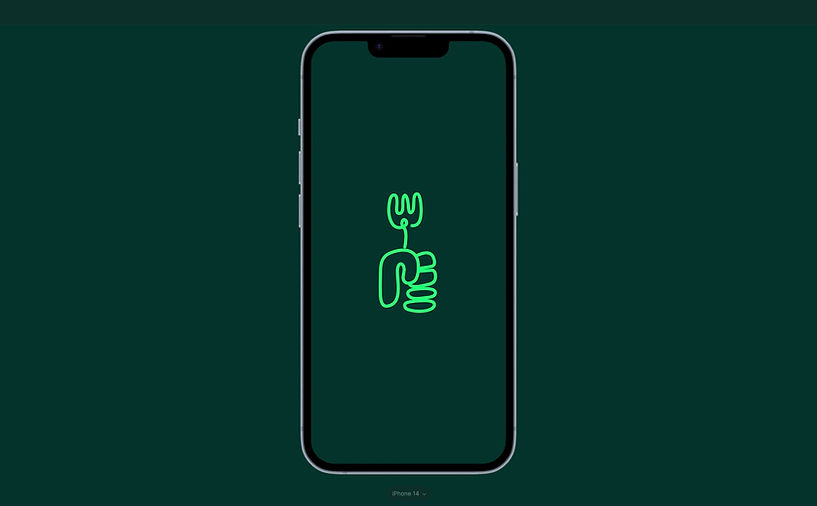
Opening Slide I created on Illustrator for my Final Presentation
Choosing Nutrition Tracking Problem Space
At the time I began the course, I had a growing interest in nutrition, which influenced my decision to explore the problem space of nutrition tracking. Among the available project options, I chose this topic because it aligned with both personal curiosity and the opportunity to design something meaningful. While the scope was broad, my goal was to create a positive and accessible user experience that would make tracking nutrition feel supportive, not overwhelming. This direction allowed me to explore how thoughtful design can simplify health-related habits and promote long-term user engagement.
The goal of this project was to design an application that offers users a simple, accurate, and reliable way to track their nutritional needs. Traditional nutrition apps are often time-consuming and impersonal. This concept focuses on delivering information in a more engaging way, using dynamic visuals and easy-to-understand formats. By simplifying the tracking process and incorporating multimedia elements, the experience aims to empower users to prioritize their well-being in a way that feels natural, supportive, and efficient.

Through user interviews, I identified seven recurring insight themes. Given the limited timeline, I prioritized three core insights to guide the final iteration of the application. I also developed two user personas based on the interview data, which served as focal points throughout the design process to ensure the interactions remained user-centered and aligned with real needs.

My goal was to keep the app intuitive and easy to navigate while including all essential features for a nutrition tracking tool. I designed the interface around three main tabs: Add Meal for logging food intake, Home for an overview of daily, weekly, and monthly consumption as well as adding personal goals and journaling entries, and Browse for exploring meals, meal plans, and related multimedia content. This streamlined structure, visible through the information architecture I drafted, ensures functionality while maintaining a clean and focused user experience.

Due to the scope of the project, I focused on building user flows for the Home and Add Meal tabs. These aligned with the two primary tasks I established for usability testing, allowing me to gather focused feedback and iterate effectively within the project timeline.


Final Sketches for each task above.


Wireframes of each final sketched task.

As someone with synesthesia, choosing green and orange felt instinctive. However, I aimed for a more clean and serious tone throughout the application’s colour palette. I kept the design simple by focusing on three primary colours, ensuring strong contrast and visual clarity—especially using bright green against a darker teal for emphasis. Gradient greens were applied to highlight active decision areas. With more time, I would have explored adding playful visual elements, such as more fun custom icons for goal badges and ingredient lists, to bring in moments of delight while maintaining usability.

Video - Task 01
Task 01

Video - Task 02
Task 02
During the prototyping phase, I made several refinements between the wireframe and the final high-fidelity version. One key change was adding a fixed action bar for the “Add Ingredient” and “Done” buttons within the selected food screen. This reduced user confusion and made it easier to complete input tasks. One of the most valuable lessons was learning to observe unspoken cues. Providing minimal context and asking users to complete a task revealed how intuitive the interaction flow was and highlighted areas where usability could be improved.

Here are the rest of the learnings I had while working on the "Let's Eat" application.
"Let's Eat" Interactive Prototype
Interactive Prototype
Future Updates
-
Expand the mindfulness aspect by adding a section for users to rate how meals make them feel, helping them track food sensitivities and preferences.
-
Build out a comprehensive "Browse" page:
-
Sync with platforms like YouTube, TikTok, and Spotify to feature curated content from health coaches and influencers.
-
Allow users to save favourite creators and see their latest content.
-
Include popular videos, meal plans for various diets, and a daily motivational quote.
-
-
Add an onboarding experience to built out an offer personalized meal recommendations for each meal type, so users don't have to start from scratch.
bottom of page


