top of page

Graphic Design
The Bodysuit Co.
Timeline
January 2021 - Present
Client
The Bodysuit Co. Founder
Tools
Illustrator

Final Logo Design
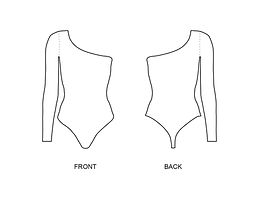
Bodysuit Prototypes
When I first spoke to my client, she was in the process of speaking to a manufacturer in hopes to get a bodysuit prototype. However, my client wanted to make modifications to the initial drafts the manufacturer had initially sent. I worked on creating three bodysuit styles my client wanted produced. I provided a rough draft of the bodysuits silhoettes.


3 Different Bodysuit Rough Prototypes
Realistically Rendered Garment


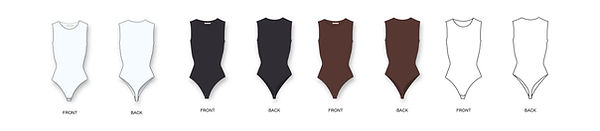

Later on, my client needed to send the colours of the bodysuits and portray the closure of the garments (two snap clips at the bottom of the suit). I made edits to the rough draft and then applied the desired colours for the pieces.
Rendered Bodysuits with the addition of a fourth design
Logo Ideation
Initially my client did not have a clear view of what they wanted their logo to look like. I only had the brief guidelines of wanting it to include brown, gold and white. As I began to ideate and send her samples, it was clear that she wanted a very minimal logo with the use of a serif font. In the ideating phase, I chose a combination of serif and script fonts from Da Font. I used a mix of textured and non textured gold, as well as imagery versus typography based logos.


First Set of Logo Designs


Second Set of Logo Designs
Final Logo
The second set of logo ideas was more promising and it made my client reflect on how she wanted to portray her company. She needed a logo that would allow her to grow her company outside of actual bodysuits. After much thought she chose the logo that incorporated the large bold serif text in the background which she could later use to brand her clothing. The bold with the thin script allowed for a nice contrast and eventually she liked the idea of dropping the word "The" from the logo itself.

Final Logo Design in the format of an instagram post
Social Media
After establishing a logo, my client wanted to start posting on her social media page. I firstly split her logo into 9 separate tiles, so she could separately post parts of her logo. Shortly after she wanted to make another post with a womanly figure (shown amongst the second logo drafts). I suggested she post three different woman of varying body types. She liked the idea and so I proceeded to create the images. I chose to make three separate images so she could post them in a continuous line on instagram.


Individual Social Media Posts
bottom of page